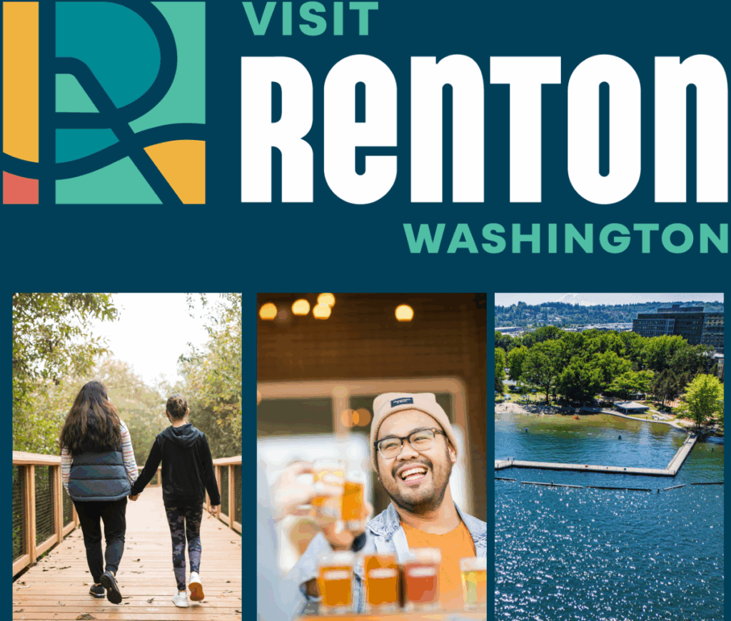
It’s here! After months of collaborative work behind the scenes, we’re excited to officially unveil the new Visit Renton logo!
The Rebrand Process
Visit Renton emerged from the Renton Community Marketing Campaign (RCMC) to help visitors and locals make the most of their time in the city. Originally Why Renton, the brand evolved to showcase Renton’s unique experiences, events, and local flavor. Designed with community input and firsthand exploration, the new identity highlights Renton’s welcoming spirit and authentic character – connecting people to all the things that make the city special.
After hours of stakeholder engagement, creative collaboration, and in-the-field discovery*, the new logo came to life!
(*Did you miss the blog about Simpleview’s behind-the-scenes tour? Check it out!)
The New Look
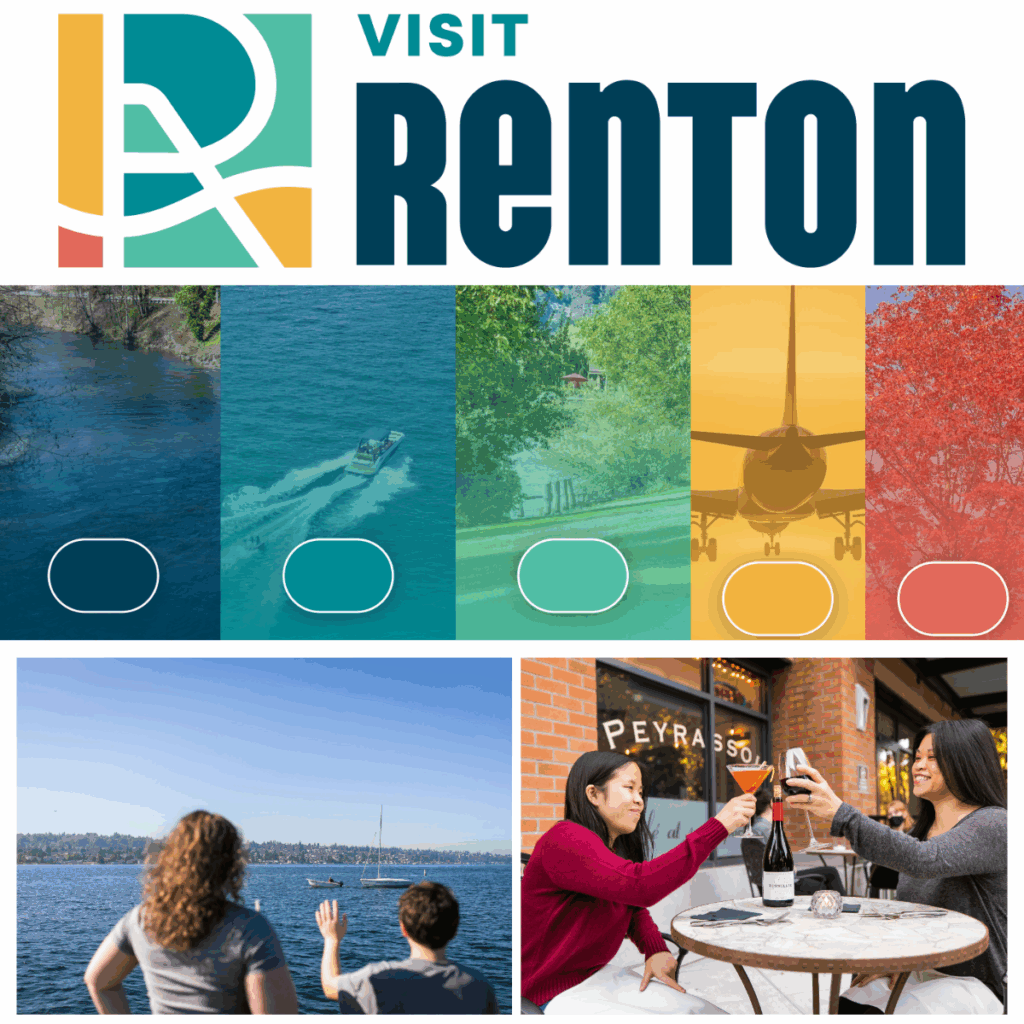
The new logo introduces a bold evolution of the classic Renton “R,” a symbol that has long held meaning across the community. Look closely and you may notice several intentional details:
-A vibrant color palette
- Two shades of blue symbolizing our stunning river and lake views
- A mint shade showcasing our wonderful greenspaces
- Sunset gold and Maplewood ember add warmth and richness to the logo
-A mosaic of shapes representing the beautiful layers of our community. A living mosaic shaped by many cultures, stories, and voices. This is not a place defined by one icon, but by a collective spirit of people coming together.
- A hidden plane wing paying tribute to Renton’s aerospace heritage—complete with a touch of an iconic plane’s blue.
- A wave-like element echoing Renton’s abundant water features
- The exclamation point forms the backbone of the “R,” symbolizing Renton’s thriving energy and vibrant community spirit.
- The subtle map element reflects Renton’s central location at the base of lake Washington, highlighting its role as a regional hub.
There’s so much to see in this new logo—reflective the people, places, and activities that make Renton unique. What do you see in the new logo—perhaps a grid, an art piece, a symbol of motion? We invite you to discover the fun “hidden” elements that reflect the many layers of Renton.


Cultural Mosaic: Showcasing Renton’s Tapestry of Community
Renton is a beautifully layered city—a living mosaic shaped by countless cultures, stories, and voices. This new brandmark embodies that richness. From multicultural festivals to diverse languages and cuisines, Renton is a place where belonging is woven into everyday life.
No single story defines us. Our strength comes from the many people who contribute to a vibrant, unified whole.
That collaborative spirit is embodied in the RCMC partnership, which brings together the City of Renton, Renton Chamber of Commerce, Renton Technical College, and the Renton School District. These partners are excited about the new logo. Here’s what a few had to say:
- Katherine Hedland Hansen, Executive Director of College Relations and Marketing at RTC, “I love the new Visit Renton logo! The colors and design capture what makes Renton exceptional—its diversity, energy, and forward-thinking spirit. It’s modern, distinct, and instantly recognizable.”
- With Visit Renton’s upcoming community rebrand, Randy is excited to share Renton’s story with the world like never before. He believes this renewed focus will shine a spotlight on what makes our city remarkable: its spirit of collaboration.
What’s Next
Stay tuned! There’s even more to come as we continue unveiling Renton’s refreshed website and digital storytelling. This is just the beginning of promoting Renton as the place to live, work, play and thrive!
